In pandas data frame, I am using the following code to plot histogram of a column:
my_df.hist(column = 'field_1')
Is there something that can achieve the same goal in pyspark data frame? (I am in Jupyter Notebook) Thanks!
6 Answers
Unfortunately I don't think that there's a clean plot() or hist() function in the PySpark Dataframes API, but I'm hoping that things will eventually go in that direction.
For the time being, you could compute the histogram in Spark, and plot the computed histogram as a bar chart. Example:
import pandas as pd
import pyspark.sql as sparksql

# Let's use UCLA's college admission dataset
file_name = ""

# Creating a pandas dataframe from Sample Data
df_pd = pd.read_csv(file_name)

sql_context = sparksql.SQLcontext(sc)

# Creating a Spark DataFrame from a pandas dataframe
df_spark = sql_context.createDataFrame(df_pd)

df_spark.show(5)
This is what the data looks like:
Out[]: +-----+---+----+----+
|admit|gre| gpa|rank|
+-----+---+----+----+
| 0|380|3.61| 3|
| 1|660|3.67| 3|
| 1|800| 4.0| 1|
| 1|640|3.19| 4|
| 0|520|2.93| 4|
+-----+---+----+----+
only showing top 5 rows
# This is what we want
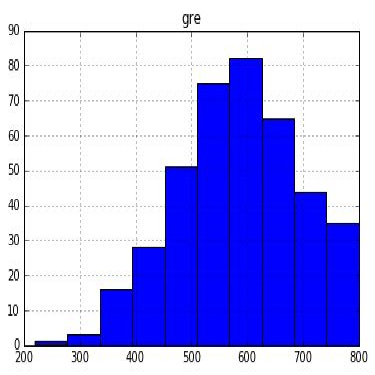
df_pandas.hist('gre');
Histogram when plotted in using df_pandas.hist()
# Doing the heavy lifting in Spark. We could leverage the `histogram` function from the RDD api

gre_histogram = df_spark.select('gre').rdd.flatMap(lambda x: x).histogram(11)

# Loading the Computed Histogram into a Pandas Dataframe for plotting
pd.DataFrame(
    list(zip(*gre_histogram)),
    columns=['bin', 'frequency']
).set_index(
    'bin'
).plot(kind='bar');
You can now use the pyspark_dist_explore package to leverage the matplotlib hist function for Spark DataFrames:
from pyspark_dist_explore import hist
import matplotlib.pyplot as plt

fig, ax = plt.subplots()
hist(ax, my_df.select('field_1'), bins = 20, color=['red'])
This library uses the rdd histogram function to calculate bin values.
Another solution, without the need for extra imports, which should also be efficient; First, use window partition:
import pyspark.sql.functions as F
import pyspark.sql as SQL
win = SQL.Window.partitionBy('column_of_values')
Then all you need it to use count aggregation partitioned by the window:
df.select(F.count('column_of_values').over(win).alias('histogram'))
The aggregative operators happens on each partition of the cluster, and does not require an extra round-trip to the host.
The histogram method for RDDs returns the bin ranges and the bin counts. Here's a function that takes this histogram data and plots it as a histogram.
import numpy as np
import matplotlib.pyplot as mplt
import matplotlib.ticker as mtick

def plotHistogramData(data):
    binSides, binCounts = data

    N = len(binCounts)
    ind = np.arange(N)
    width = 1

    fig, ax = mplt.subplots()
    rects1 = ax.bar(ind+0.5, binCounts, width, color='b')

    ax.set_ylabel('Frequencies')
    ax.set_title('Histogram')
    ax.set_xticks(np.arange(N+1))
    ax.set_xticklabels(binSides)
    ax.xaxis.set_major_formatter(mtick.FormatStrFormatter('%.2e'))
    ax.yaxis.set_major_formatter(mtick.FormatStrFormatter('%.2e'))

    mplt.show()
(This code assumes that bins have equal length.)
this piece of code simply makes a new column dividing the data to equal size bins and then groups the data by this column. this can be plotted as a bar plot to see a histogram.
bins = 10
df.withColumn("factor", F.expr("round(field_1/bins)*bins")).groupBy("factor").count()
This is straightforward and works well.
df.groupby(
  '<group-index>'
).count().select(
  'count'
).rdd.flatMap(
  lambda x: x
).histogram(20)
